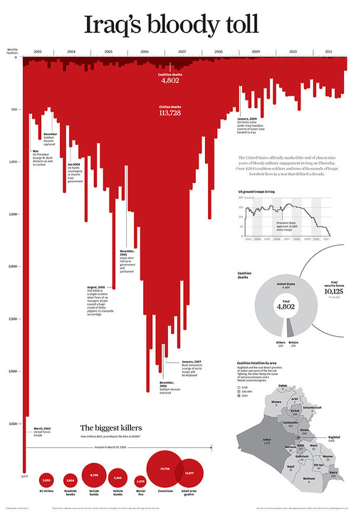
Casualties of the Iraq War

- Title
- Casualties of the Iraq War
- Creator
- Simon Scarr
- Date of Creation
- 2011
- Source URL
-
www.simonscarr.com
- Description
- A visualization of casualties of the Iraq war. From the creator: "This graphic was created to mark the end of the United States' military engagement in Iraq in 2011. Over 4,800 coalition soldiers and tens of thousands of Iraqis lost their lives in the war.
One deliberate design choice with this graphic was the visual metaphor of blood. This striking visual would hopefully draw the reader into the graphic."
- Example Type
- data visualization
- Visualization Types
-
- bar chart
- line chart
- map / spatial data
- infographic
- dashboard
- Subject Area
- war
- Original Context
- news article
- Audience Level
-
- Adult beginner (high school and older)
- Intermediate
- Audience Composition
- General
- Pedagogical Description
- Data visualization tells a story. Emotional
- Ethical Quandries
- Questions about representation (e.g. who is represented and who is not represented?). Issues of spatial aggregation in the map (How do casualty count port to troop population size? Can we know if one area was more dangerous than another?)
- Linked Instructional Materials
-
www.youtube.com
- Date Added
- 6/26/2020
